
Campo do Tejo: A visual journey
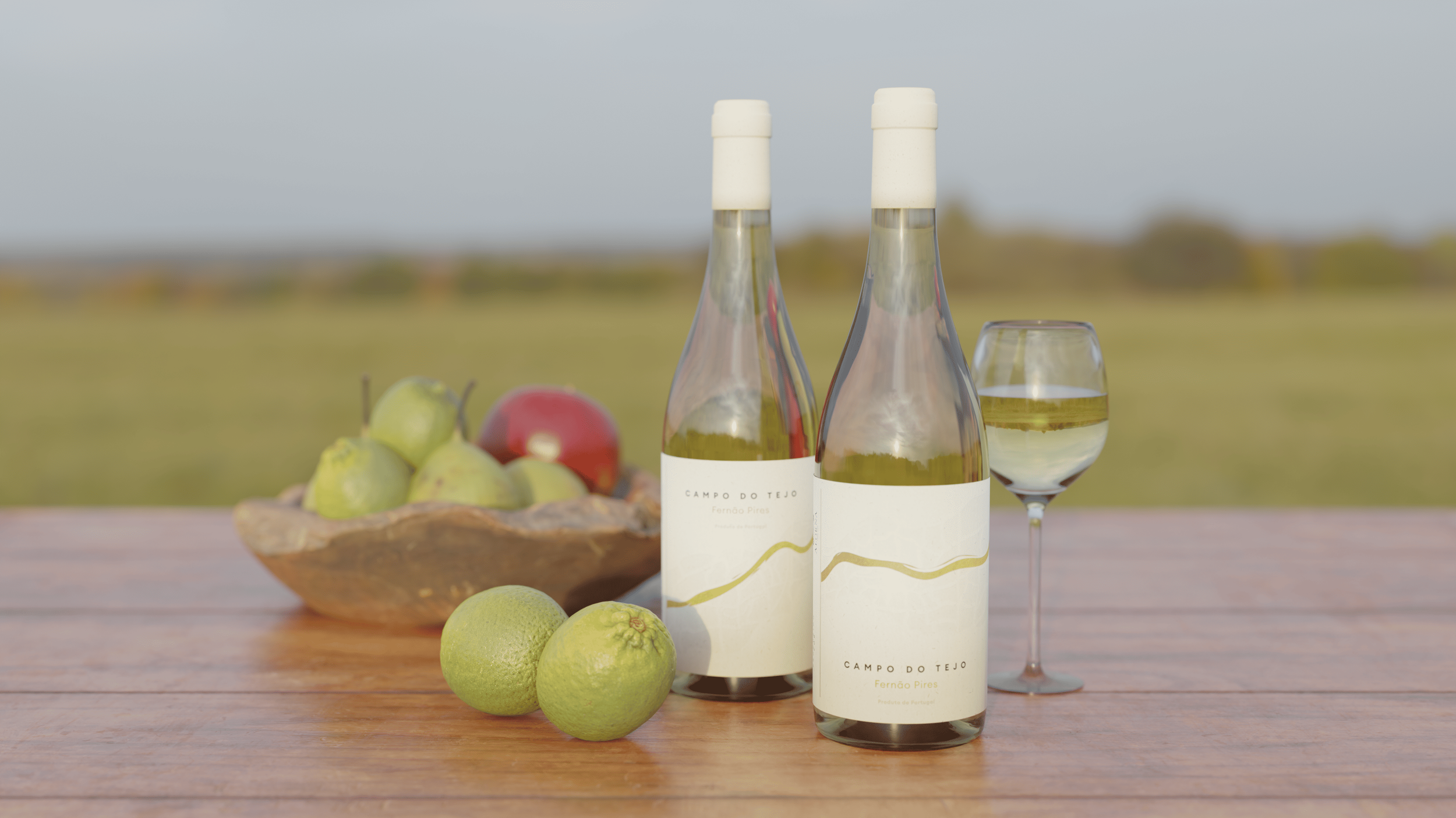
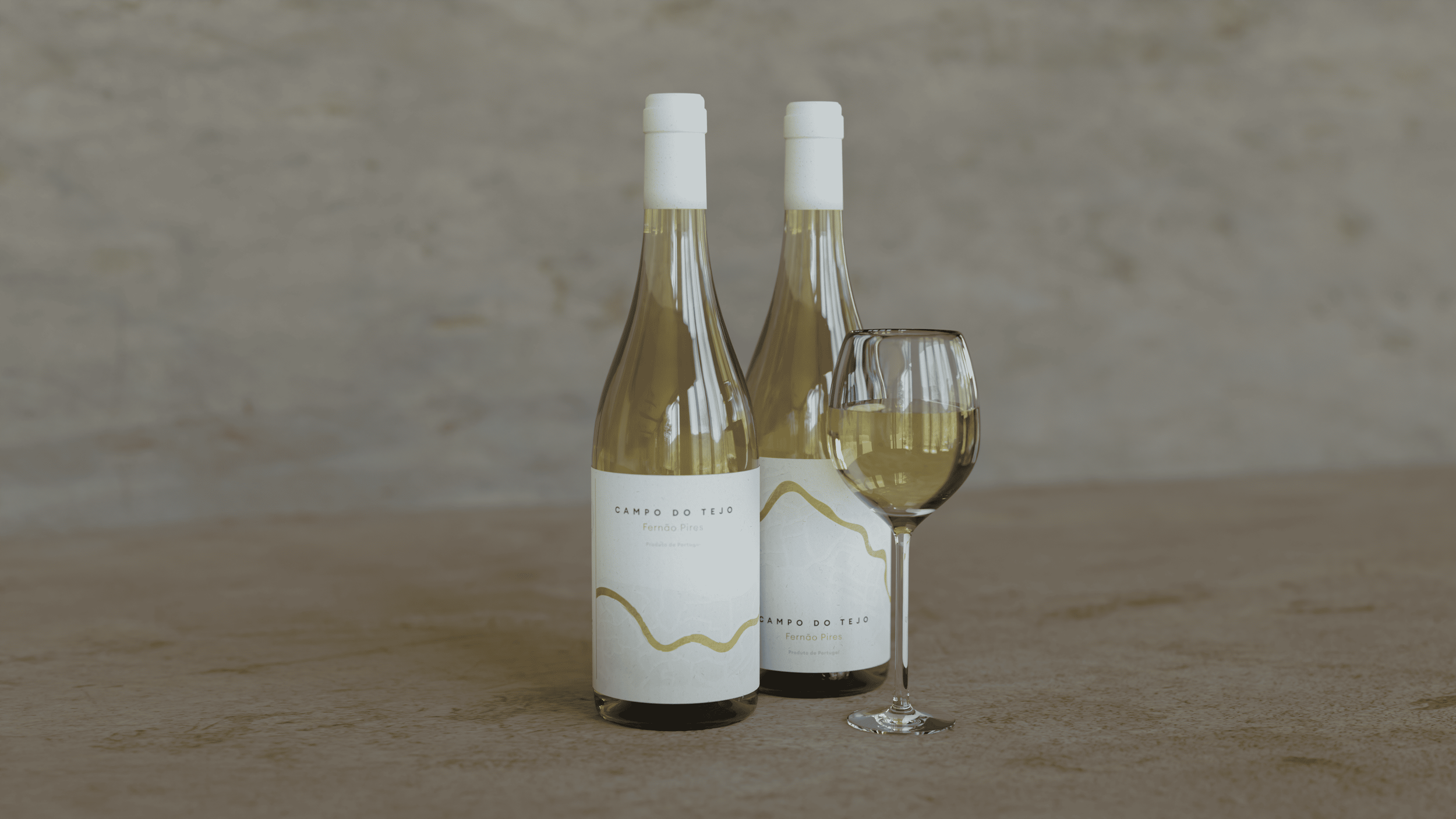
The branding and packaging for the wine brand Campo do Tejo is a visual ode to its origins. The design is deeply rooted in the geographical landscape and the topography of the region surrounding the Tejo river, the primary source of the grapes for this wine.
My role
Research, 3D modeling and rendering
Year
2023

The concept
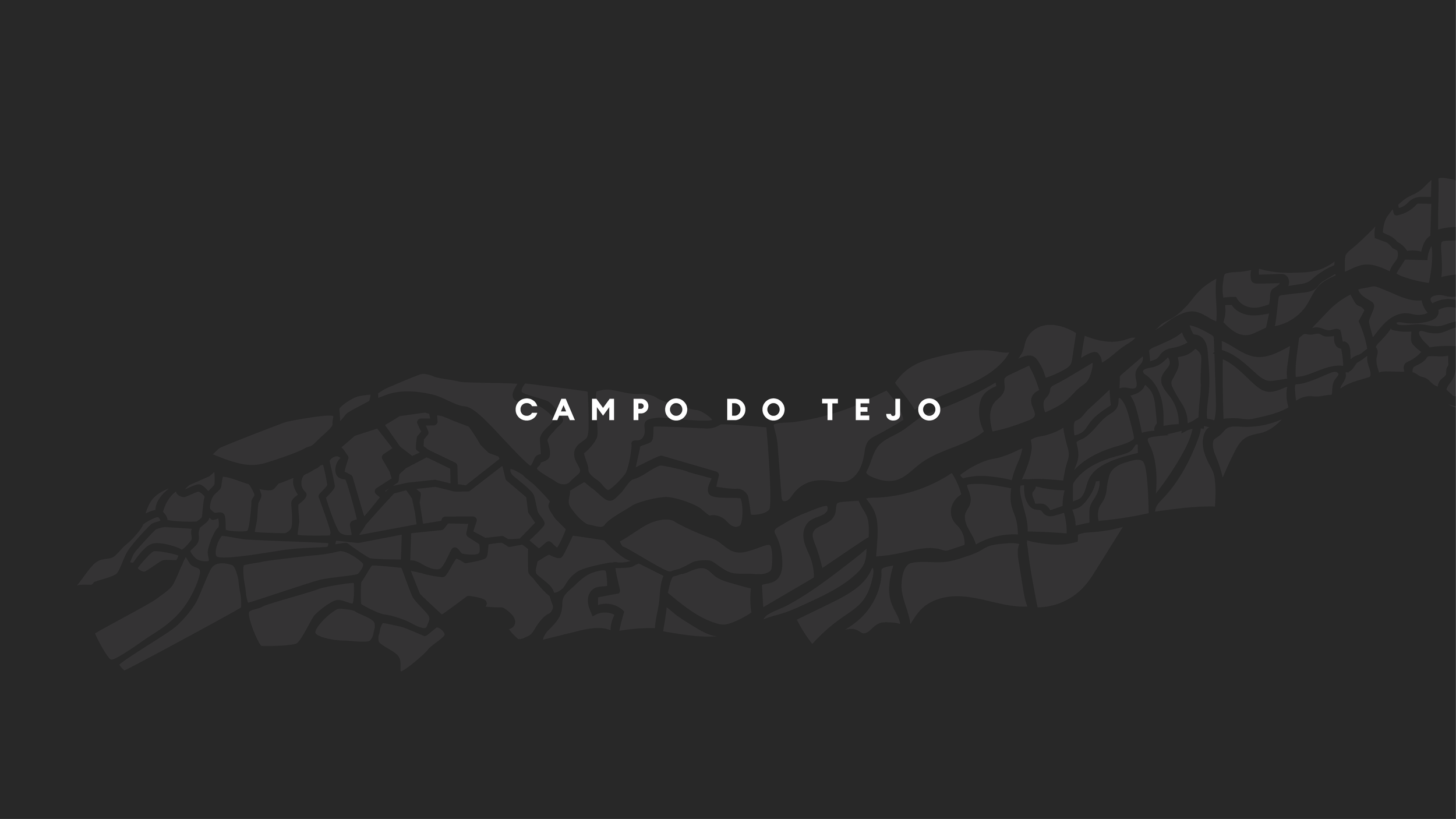
The concept revolves around a collection of six bottles that, when placed together, form a cohesive map of the entire region. This innovative approach not only tells a story but also transforms the packaging into a collectible art piece.


Distinctive but subtle
The labels feature a distinctive, wave-like design. This abstract pattern mirrors the aerial view of the terrain and the flowing contours of the river, bringing a sense of place and movement to the bottle. The subtle, elegant lines evoke the gentle curves of the land, while the clean, minimalist color palette reflects a modern and sophisticated sensibility. The design successfully marries the rich heritage of the land with a refined, contemporary aesthetic.
