Azeite Raiz: The Roots of Exquisite Olive Oil
The branding and packaging for "Raiz," a premium olive oil, centers on the profound concept of roots. This design endeavor seeks to visually articulate the enduring legacy of the very first olive tree, emphasizing its continued presence and influence in today's exquisite olive oil.
My role
Branding and packaging design, 3D rendering
Year
2022

The visual language
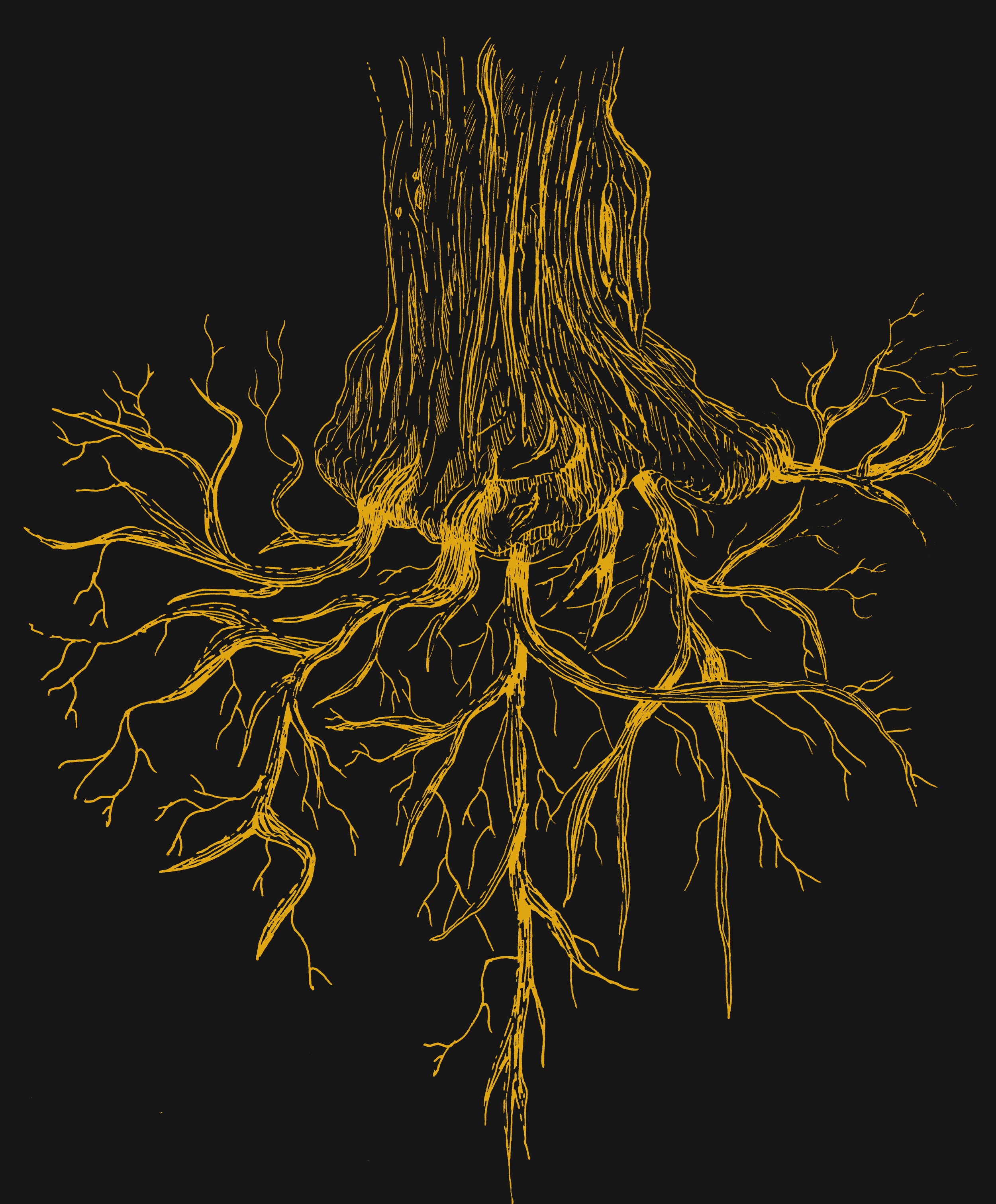
The visual language of Raiz is an intricate tapestry of nature and heritage. Each bottle becomes a canvas, adorned with detailed illustrations of branching root systems. These organic forms elegantly climb the bottle's surface, symbolizing the deep connection to the earth and the historical lineage of olive cultivation. The choice of a subdued, monotone color palette, featuring bright yellows and subtle metallic accents, further reinforces the natural and luxurious character of the product.


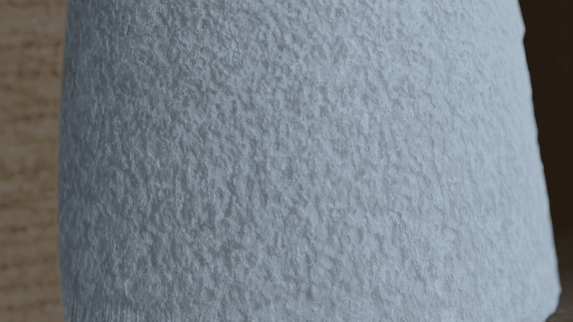
Texture tells the story
The texture of the bottle itself often subtly mimics the rough, ancient bark of an olive tree or the intricate patterns of roots, inviting a tactile experience that complements the visual narrative. This thoughtful approach ensures that the design not only captures the eye but also conveys the profound history and quality inherent in every drop of Raiz olive oil.