
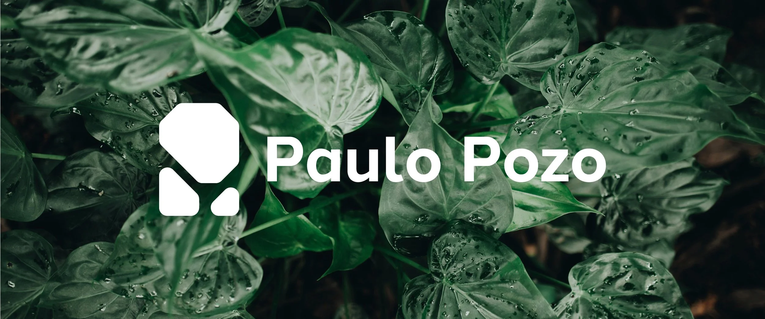
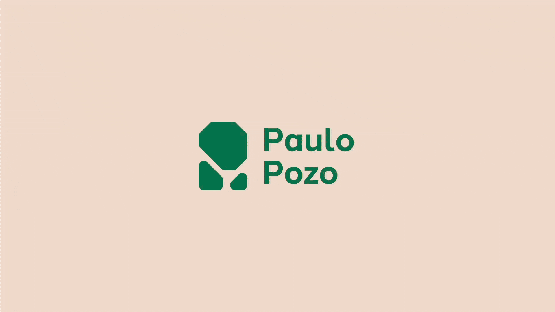
Paulo Pozo Design
Creating a personal visual identity is a challenge faced by every designer at some point. After years of working across various fields, it became necessary to develop an updated and flexible visual system, one that could adapt to different disciplines while encapsulating the essence of the work itself. The goal was to craft a visual language that communicated the core principles behind each project and reflected not only a design philosophy but also the personality and interests that extend beyond the realm of design.
My role
Visual identity design
Year
2025
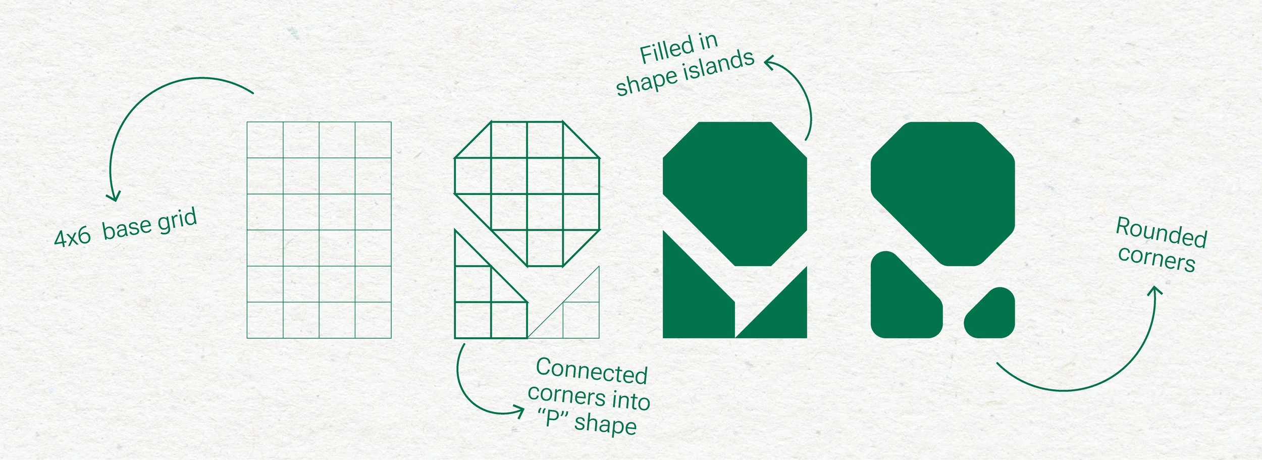
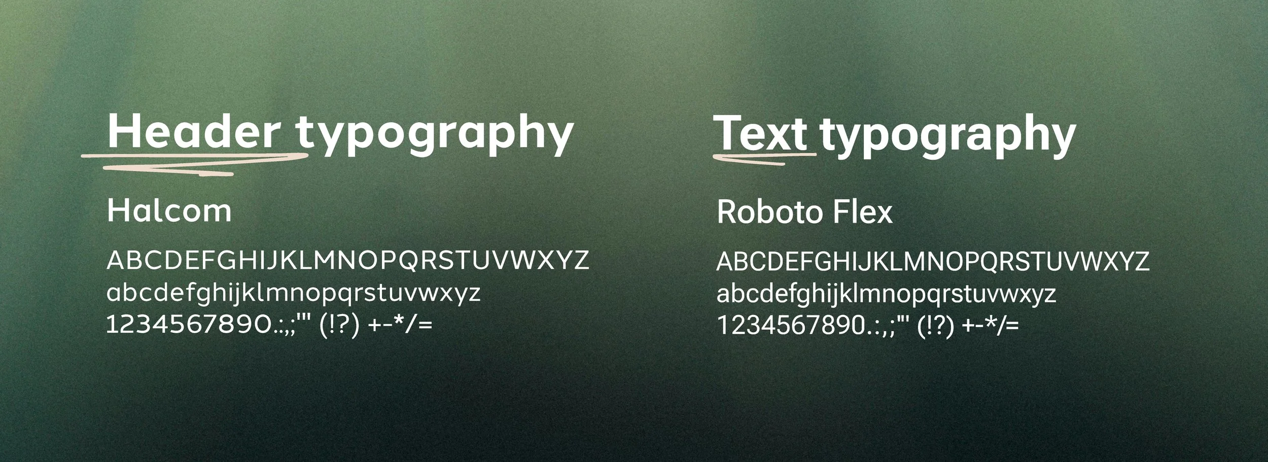
Shapes and textures
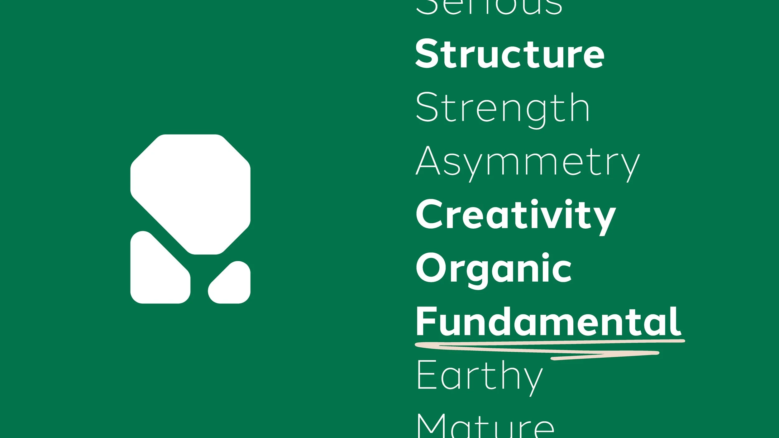
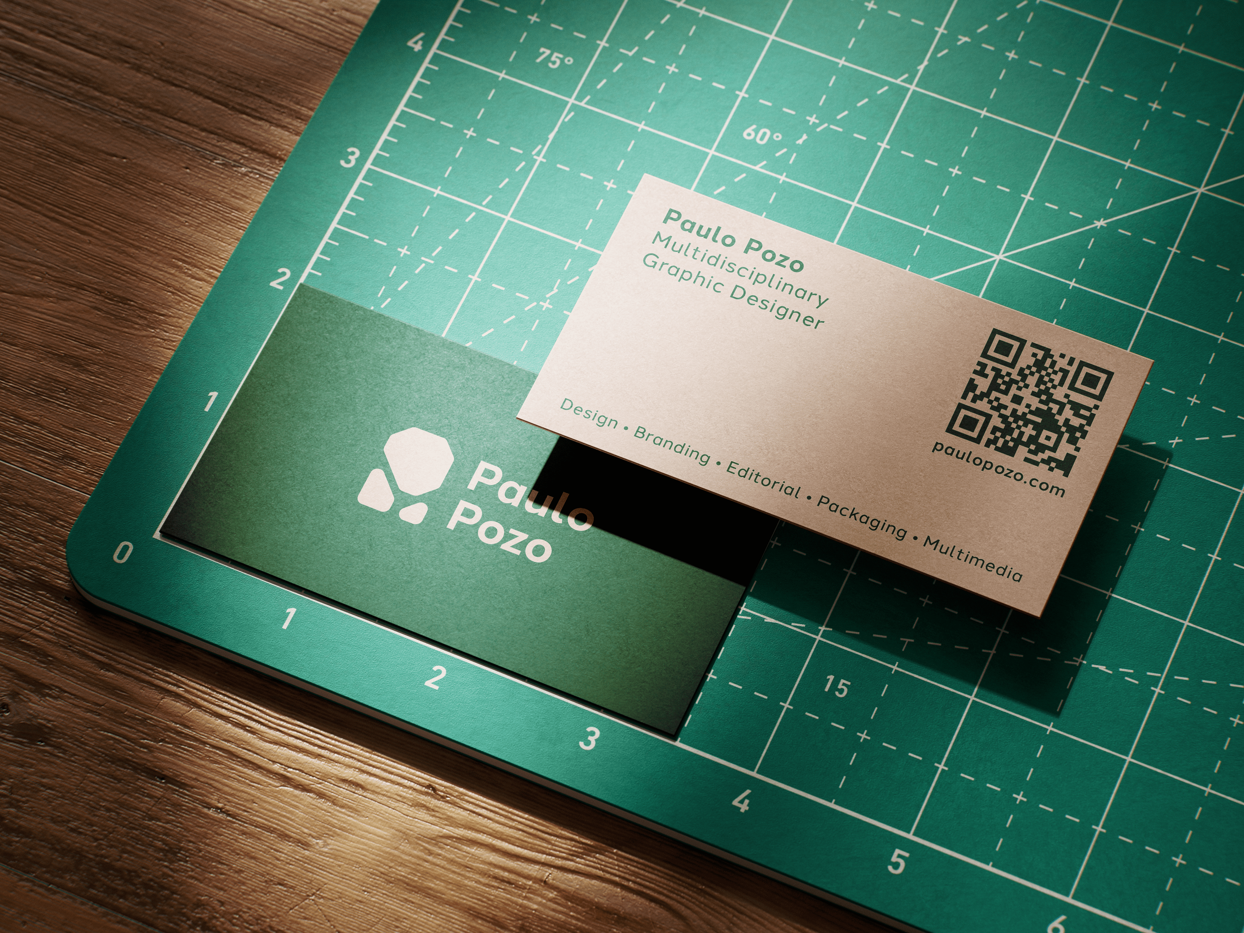
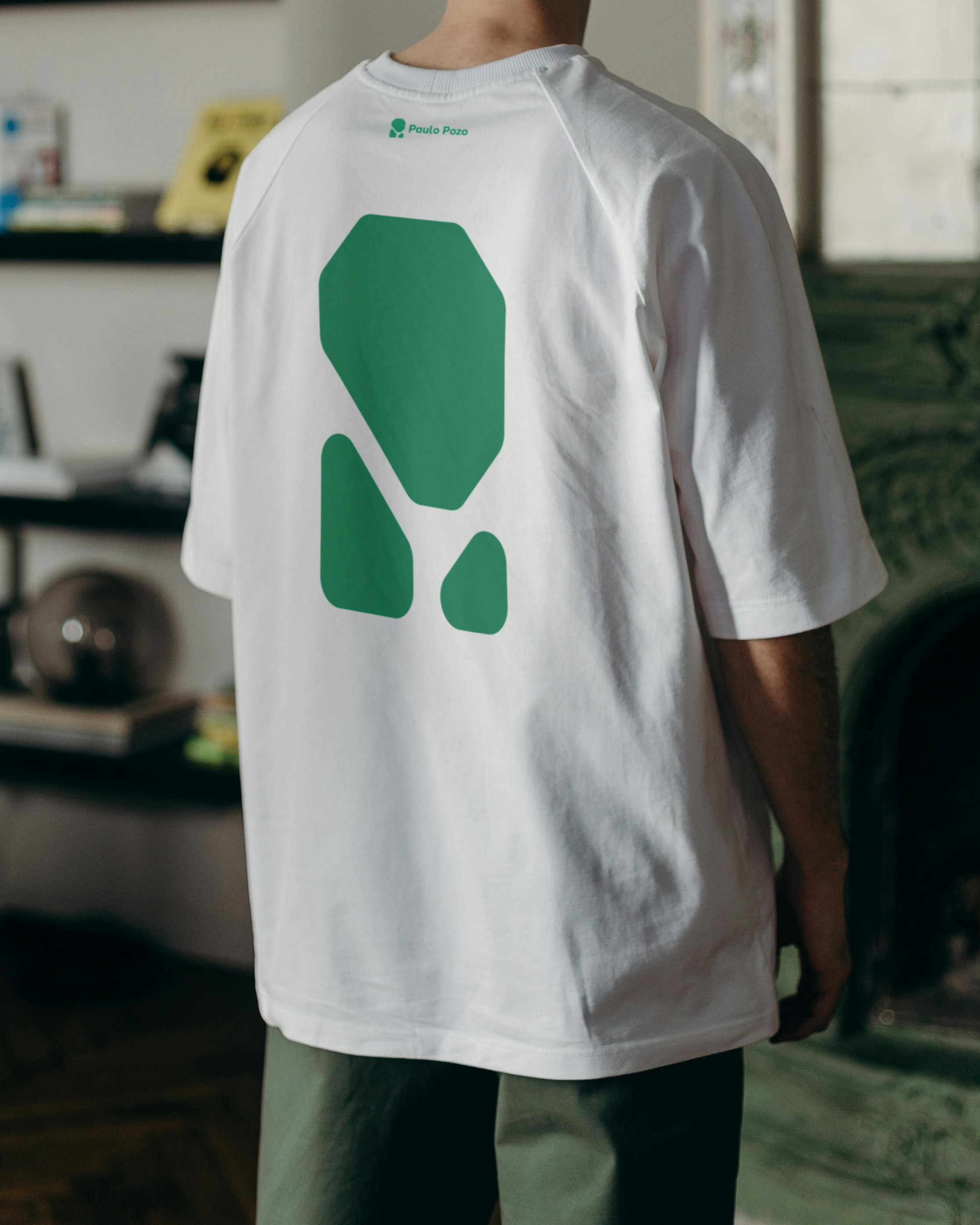
From the outset, texture stood out as a foundational element. Natural and organic textures echo the tactile quality often sought in creative projects, grounding the work in something tangible and earthy. This emphasis on texture introduced specific challenges, most notably, crafting a logo that could remain legible across diverse, dynamic backgrounds while blending into them naturally. After numerous iterations, the final version began to take shape: a mark that conveys structure and resilience, softened by the subtle erosion of time and experience. Rooted and grounded, the visual language reflects a balance between solid foundations and aspirational creativity.
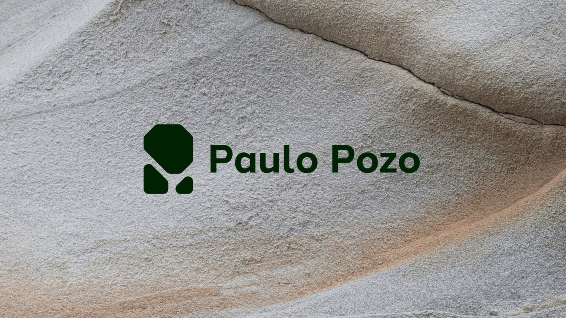


Nature as an inspiration
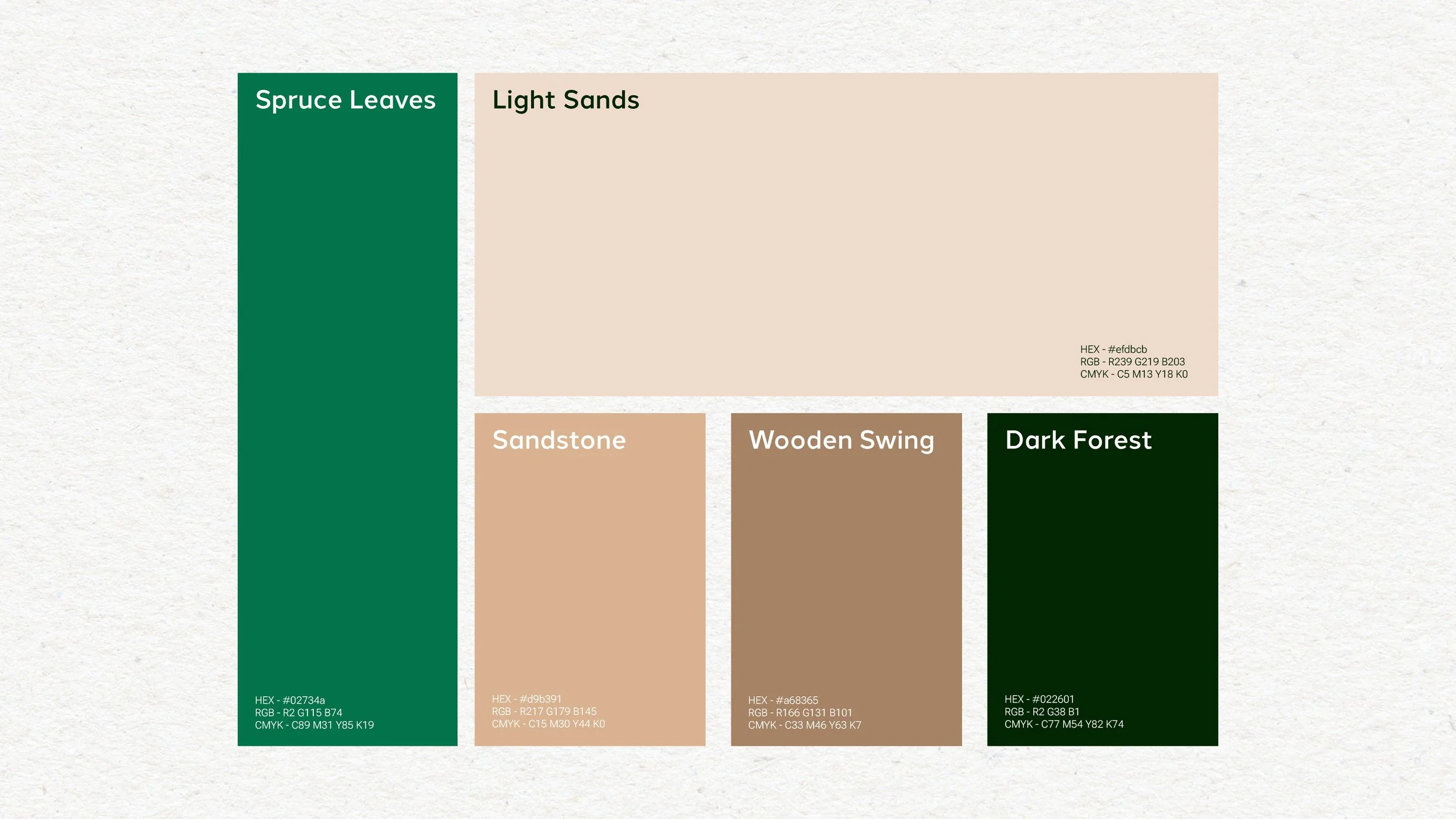
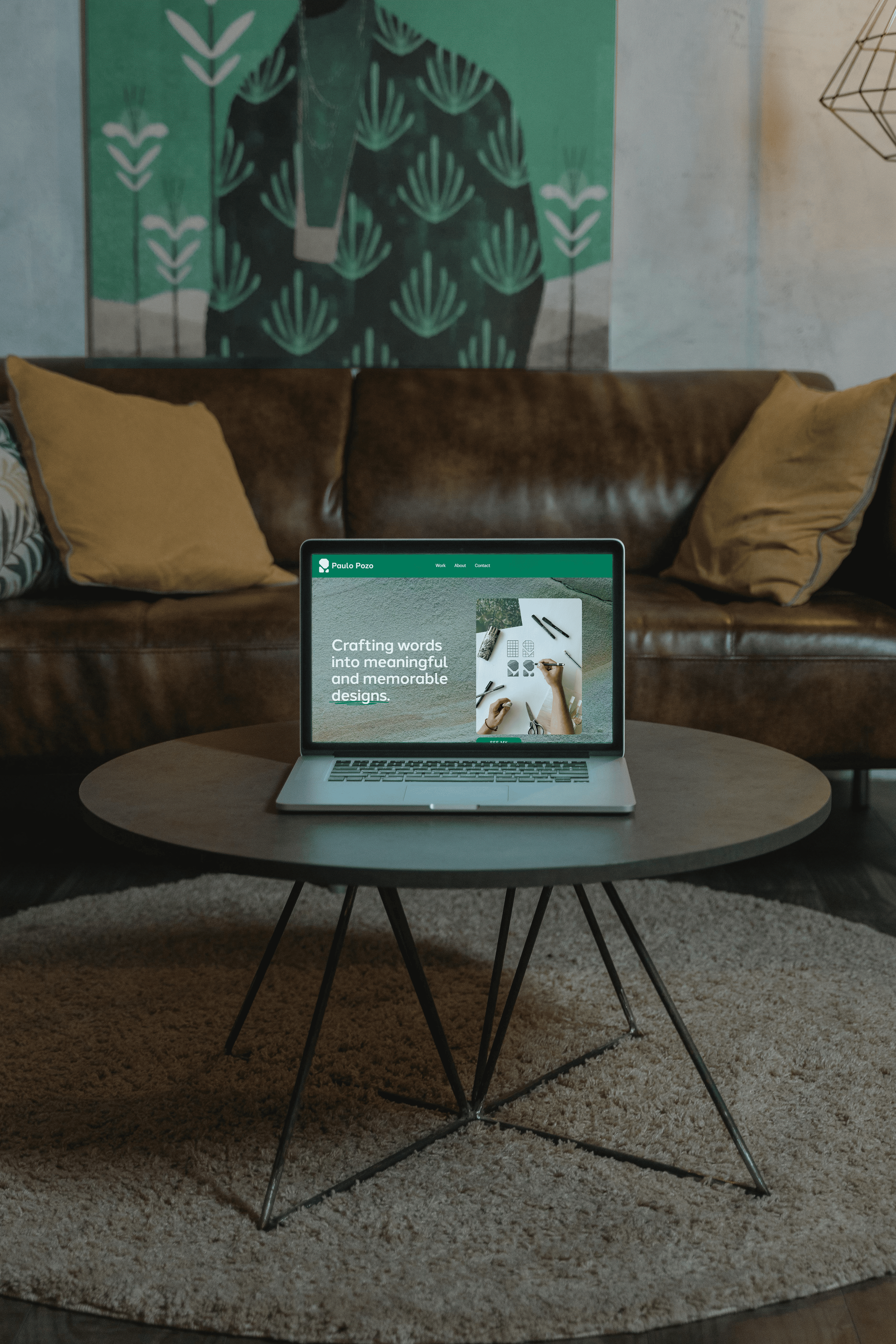
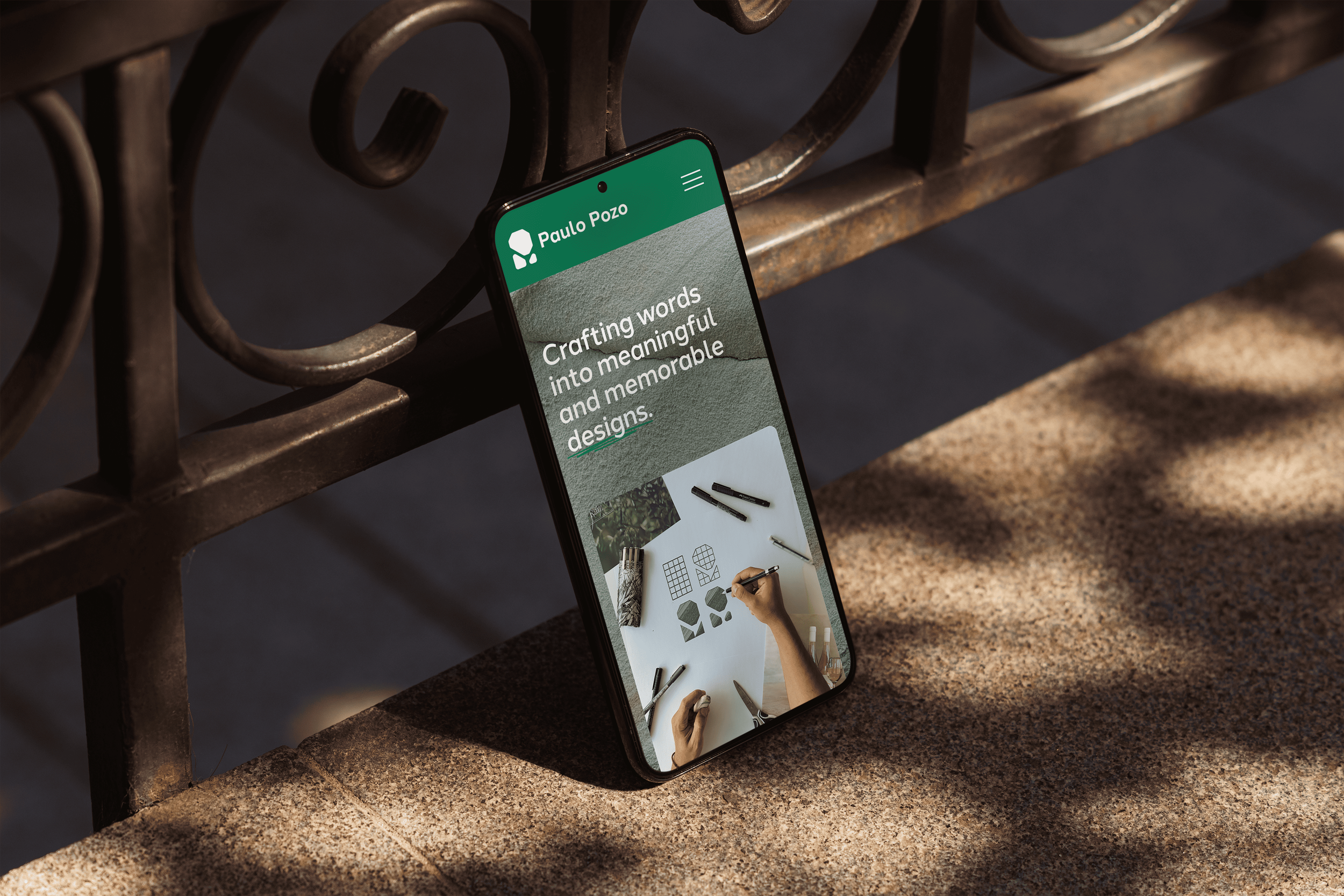
A deep connection to nature subtly informs the creative process. While professional work always responds to the needs of a given brief, there's often an underlying influence drawn from natural environments. The way nature operates mirrors aspects of the workflow: warm tones and green highlights evoke the feeling of a pine canopy casting shadows on sandstone cliffs, breathing calmly in stillness. Whether poetic or simply a personal preference for these tones and what they convey, the natural palette helps tell the story.

The ‘vibe’ is important, as they say
The intended atmosphere is one of comfort, warmth, and trust. This design approach encourages sensory experiences that foster openness, collaboration, and creativity. It’s a space designed for meaningful conversations, grounded ideation, and thoughtful execution, a calm environment where goals are met with clarity and ease. Think of it like a cozy coffee shop: smooth jazz playing, moody lighting, and a warm drink in hand while ideas come to life. That’s the kind of process this aims to create.


Creating a day-to-day connection
At the heart of this visual identity lies connection. Whether it begins in a casual conversation about a new project or develops through the relationship built with a client or audience, connection is the lifeblood of any meaningful brand. It's the difference between just another logo and something that resonates, a shared reflection of human experience. Ultimately, it’s about understanding, empathy, and authenticity. That’s the kind of connection this identity seeks to foster, every single day.
